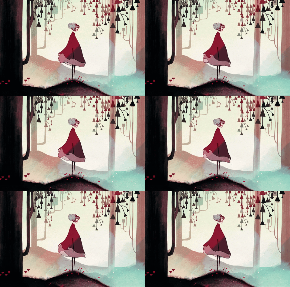
Gris is platform game created by Nomada studio and utilises minimal narrative, simple platform mechanics and elegant watercolour art. The watercolours are splashed across the screen and more and more are added as the player progresses indicating that the young woman is becoming more whole again and recovering from her trauma.
The narrative is open to interpretation as we find ourselves at the start of the game with a young woman in despair. The grief that she is feeling has caused her to lose her voice and throughout the game the mission of the player is regain it.
I interpret this voice-loss as the death of a close family member, such as her mother.
Five different colours are used to define the levels; red, green, blue, yellow and pink, with the prologue depicted in grey. The colours identified here come from the studio and artists who created this game and are depicted here on this level narrative chart.

Source: https://www.gamesindustry.biz/articles/2019-01-15-the-beauty-and-meaning-of-gris
Clearly they are the five stages of grief: denial, anger, bargaining, depression and acceptance but why these colours?

Red is generally associated with anger and passion, however, in Gris red represents the first stage of grief, denial. The young woman is denying her loss and as such her love and passion are still very much alive and this is shown in red. Denial can also have anger intertwined, anger at those trying to tell you to move on and anger at the circumstances that have brought about this grief.
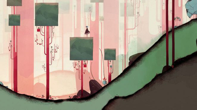
Green is a cool, soft secondary colour that is generally used for positivity and progress so in a sense green is an apt colour for anger. Not so much for portraying the emotion but more for representing the headway that is being made. The young woman has now progressed to the second stage of grief and even though anger is painful it means that she is still moving forward in healing.

Blue is used to portray loyalty and steadfastness in branding; here it is used for bargaining. Blue is often seen in banks and healthcare. The deep ocean blue used in this level could convey a need for security and a desire to haggle over the life lost and the willingness to give up everything just for a few more moments.
Blue can also be used for sadness and forlornness.
Blue light also reduces your production of melatonin, which is the hormone that will help you sleep. With lowered melatonin a person is more susceptible to depression, sleep loss and seasonal affective disorder (SADs).

Yellow can be a warm and bright colour but if overused it can cause visual fatigue. Yellow is used to grab a persons’ attention and is generally seen as a colour of enthusiasm, however, yellow can be difficult to read due to its brightness and the amount of light it reflects. This can cause fatigue and eye strain.

Pink is a feminine colour and the colour of nurturing. It may represent her mother, which in my interpretation of the game is who the young woman is grieving for. The young women has now reached the final stage of grief, acceptance and through this journey she has passed many colours to be able to find her voice. Pink is often seen in a sunrise, highlighting the clouds in the sky. Pink is a warm, comforting colour; a gentler version of red, which brings us back to the beginning.

RGB colour chart
The above colours discussed when combined create white light. White is represents clarity and this clarity could not have been achieved without enduring the five stages of grief. This combination shows that the young women has reached the end of her journey and can now accept and move past her sadness.
This is a striking game that could easily be considered art, with a lack of dialogue and explicit narrative Gris focuses the player on the visual and audio of the game. Together these create an engaging and immersive experience that gently navigates the player through the challenging concepts of death and grief.