"They [the visuals] are amazing!! You have no idea how good it is to finally see something that actually looks like we'd imagined it (if not better), especially after years of work.
You have made our day if not year! "
-Fern Dawson, Curator - Lincoln Cathedral
Lincoln Cathedral's new extension will house a new gallery, children's learning centre, restaurant and shop. All of this is being built in a modern extension by Simpson & Brown Architects.
My role here was to design and visualise what the gallery and the children's learning area could look like.

As the subject matter for the main gallery was serious, I decided to keep the colours muted and so as to allow the objects to shine. The main object is a large Romanesque Frieze that is to be displayed on the rear wall, which is the outer wall of the Cathedral itself - this is to represent what the Frieze could have looked like in situ.
Many of the objects have incredible historic value to the Church of England and as such the lighting in the space needed to be as low as possible so as not to damage them.

As this is a modern extension on to a 900 year old building the shape of the space is odd. The walls taper but so does the roof, meaning that some areas feel very open while others feel very enclosed.
The Romanesque Frieze is as old as the building, visitors must be discouraged from touching it - this is the same for many of the open display objects. The plinths that the objects are on are large, monolithic to represent the stalwartness of the church but also the depth of the plinth deters people from leaning and touching things!


On the converse side, the children's learning area - known as The Discovery Centre - is a small, bright room with lots of interactivity.

The room focuses on the Works Department of the Cathedral (the ones who keep the building standing and conserve the objects). The zones are full of hands-on interactives and AV games and videos documenting how the conservators work with the Cathedral.
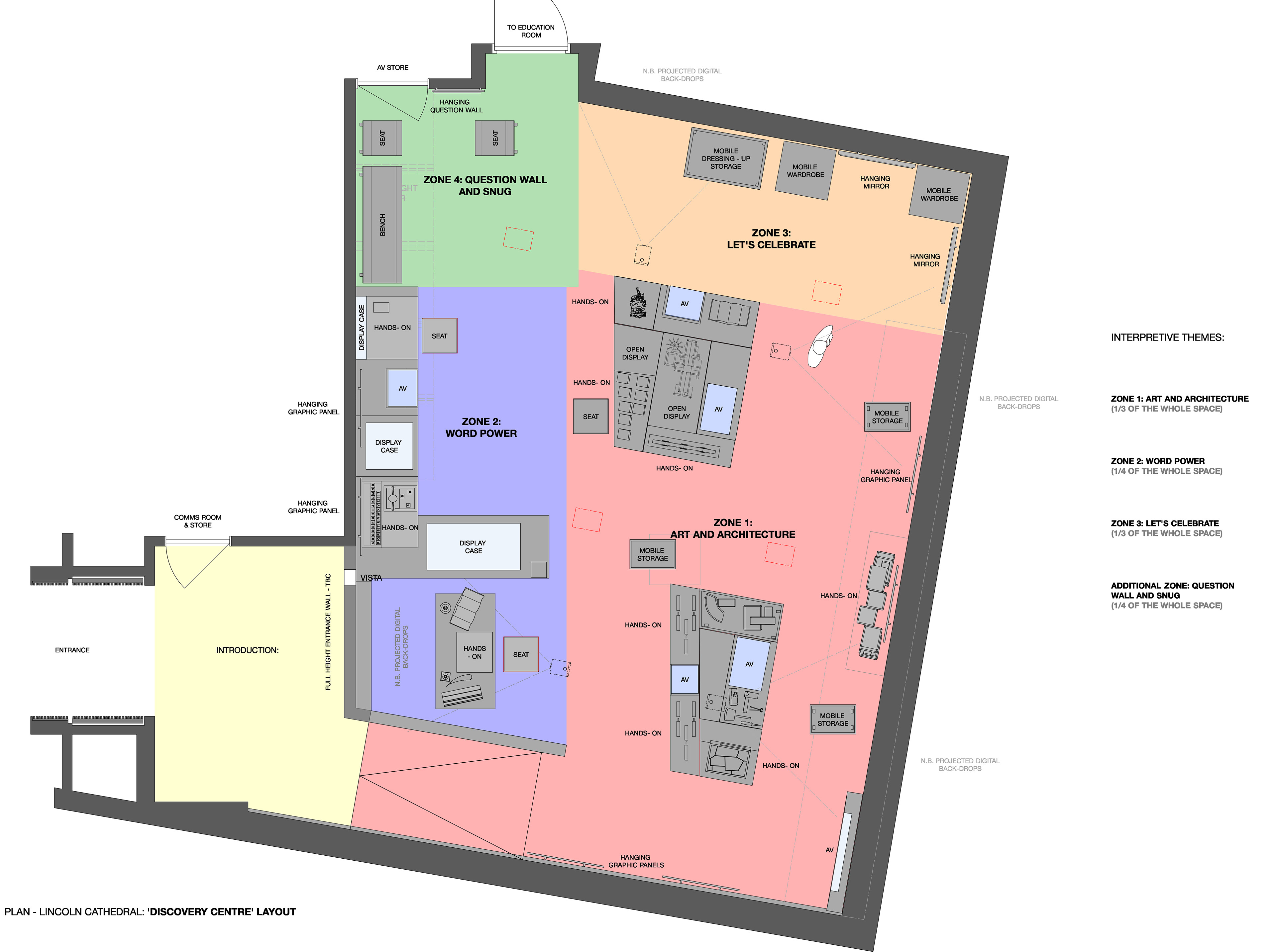
Like many projects, this space is split into distinct areas but is subtly shown through the colour of the horizontal surfaces.
As well as being a children's area, this space serves a second purpose. A Temporary Exhibition Space. this aspect became particularly challenging as the client wishes for all the furniture to be mobile and the fit through the door to the education room. The designs of the central plinths had to be demountable and transportable - not an easy feat when there are glass display cases on top.


The form of the central plinths follows the strange shape of the room and the colours used are to contrast heavily with the somber mood of the main gallery next door.